
Bowlsome Smoothie
A growing health-focused brand offering fully customizable smoothie bowls began experiencing longer wait times as foot traffic increased across locations, largely due to complex, manual ordering and high levels of customization.
The Problem
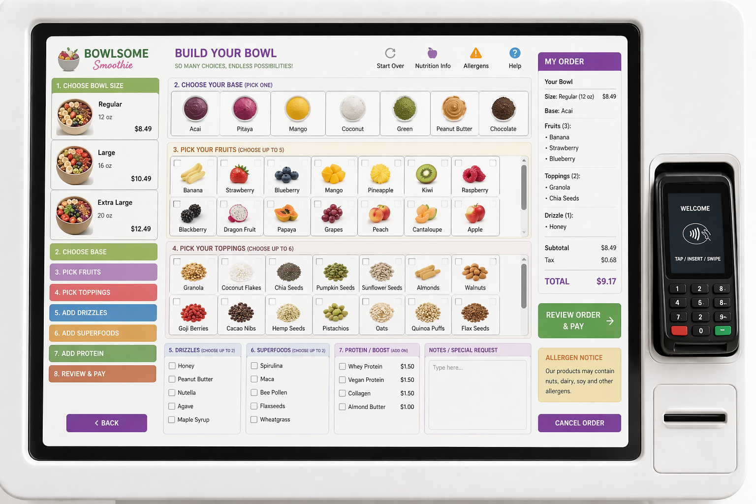
The current interface overwhelms users by presenting too many options at once without a clear starting point or guided flow. As a result, users experience higher cognitive load and a slower, less intuitive ordering process.
Low-Fidelity Wireframes (Exploration & Structure)
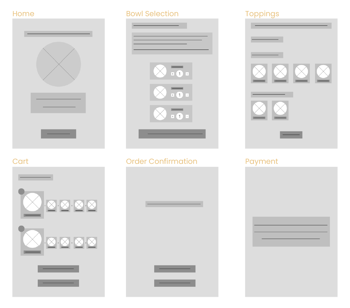
The low-fidelity wireframes were created to focus on structure, flow, and decision-making without visual distractions. The goal was to map a clear step-by-step ordering journey and reduce complexity within the interface. This helped define how users move from size selection to customization and then confirmation in a logical, guided flow. Rapid iterations were used to test layout hierarchy, grouping, and interaction patterns efficiently. The focus remained on validating a simple, intuitive structure before introducing visual design and branding.
High-Fidelity Wireframes
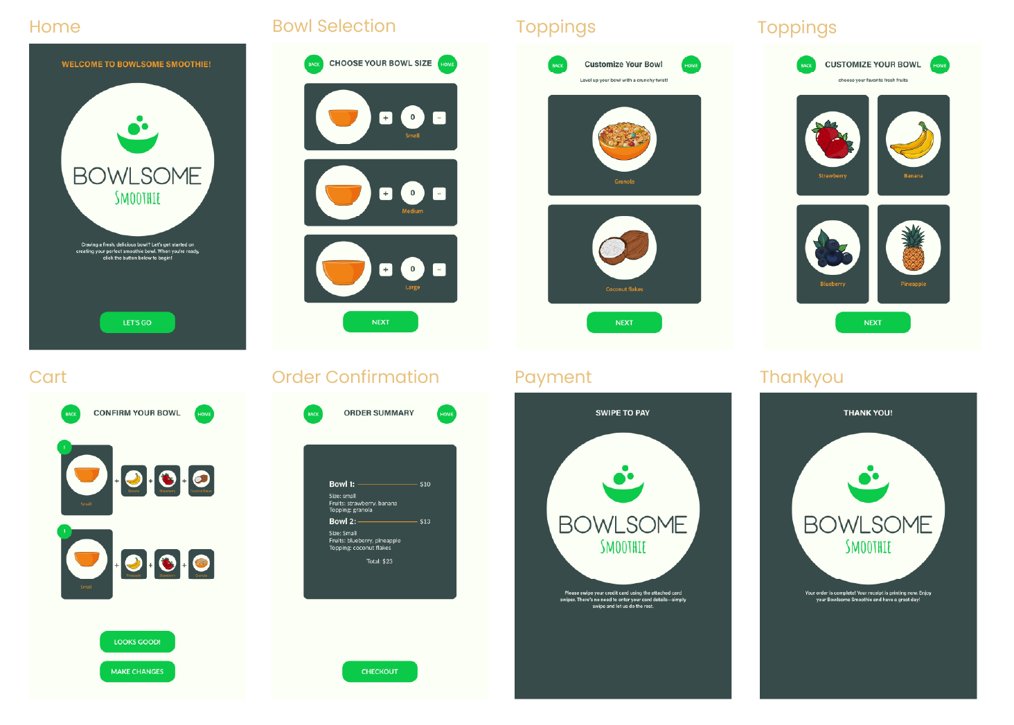
The prototype uses a guided step-by-step flow to simplify decision-making in a high-traffic kiosk environment. Key actions like “Select Size,” “Add to Bowl,” and “Confirm Order” are clearly prioritized to guide users through the process without confusion. Instead of showing all options at once, customization is progressively revealed to reduce overwhelm and keep focus on one decision at a time. Strong primary buttons drive users forward, while secondary actions like edit or back are kept less dominant but easily accessible. A final review step ensures users can quickly confirm or adjust their order before checkout, improving clarity and reducing errors.me Smoothie’s healthy and vibrant brand.