Goodhope Bags – Seasonal Email Campaigns
A series of promotional email blasts and web graphics developed across multiple seasonal campaigns. The work marked a shift away from the brand's previous text-only email strategy, introducing bold product photography, thematic layouts, and dynamic compositions built in Adobe Photoshop to better capture customer attention and communicate the brand's visual identity.
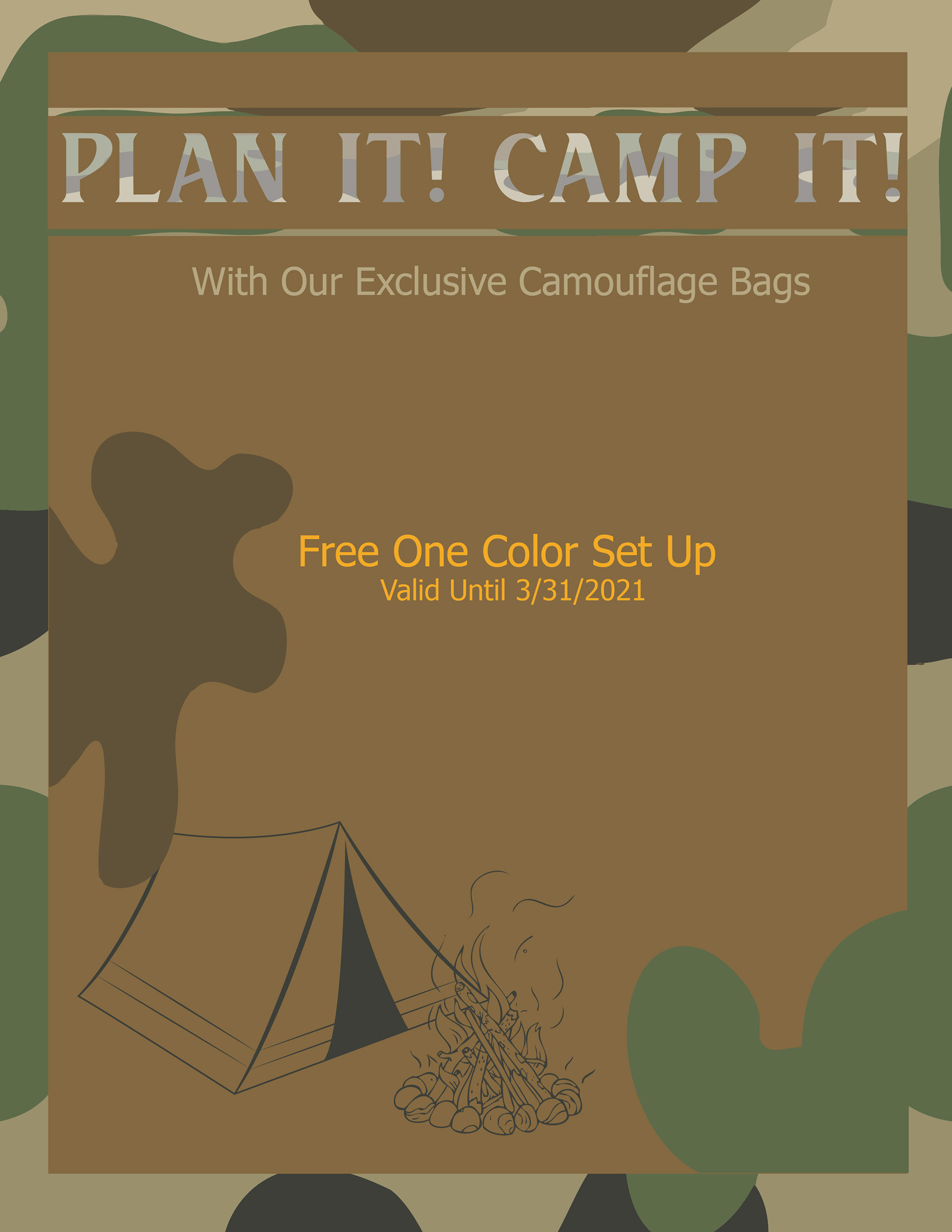
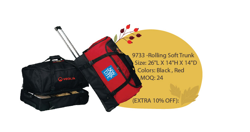
Plan It Camp It
I carried the camo pattern across the entire background to immediately immerse the viewer in the outdoor theme rather than just showing the product in isolation. The tent and campfire illustration was added to reinforce the adventure narrative and give the design personality, while keeping the promotional offer centered and readable against the earthy toned panel.
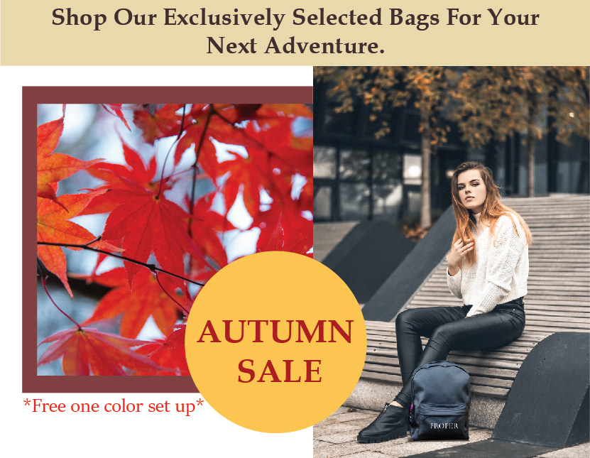
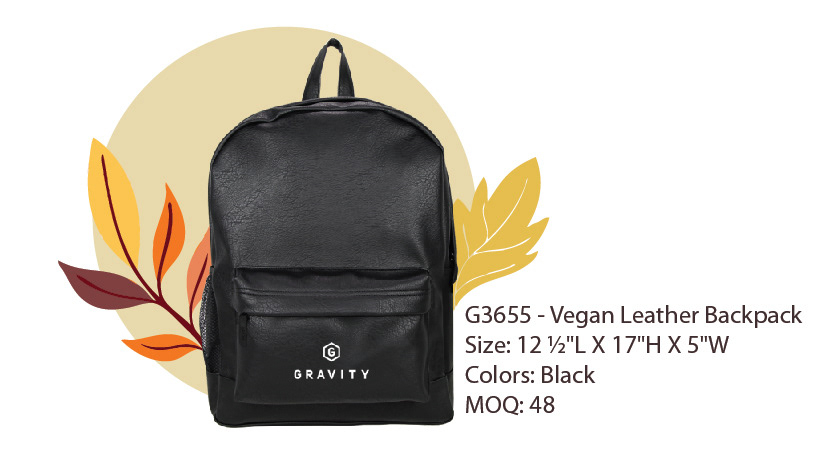
Autumn Sale
I split the layout between autumn foliage and a lifestyle shot to immediately set the seasonal mood while keeping the focus on how the bag fits into everyday life. The circular badge was placed at the intersection of both images to pull the composition together and make the sale message impossible to miss, while the warm gold color kept it feeling on-brand with the autumn theme rather than like a generic promotional sticker.
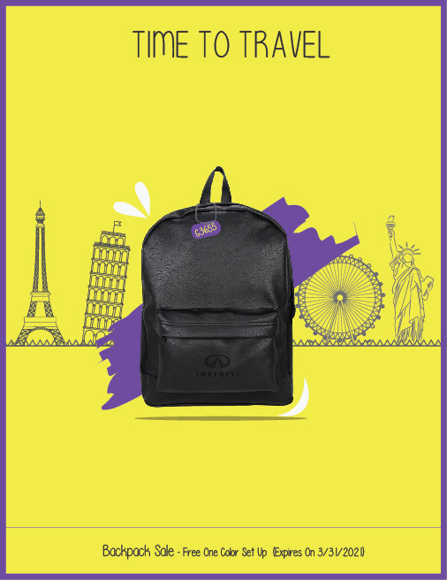
Time To Travel
I chose a vibrant yellow background to make the black backpack pop as the clear hero of the design, letting the product speak without competing elements. The world landmark illustrations were kept as outlines in the background so they communicate the travel theme without overpowering the product, while the purple paint stroke behind the bag adds energy and depth to what could have otherwise been a flat, minimal composition.