Overview:
A comprehensive brand guide and logo were developed for BeatsFest, a music streaming service focused on a young, diverse, and tech-savvy audience. The brand guide establishes a cohesive visual and tonal framework, while the logo captures BeatsFest’s mission to resonate with its energetic, youth-oriented audience.
Brand Vision & Mission Alignment:
With a mission to cater to Gen Z and young Millennials, BeatsFest required a bold, accessible identity that reflects its youthful, inclusive, and adventurous personality. The brand guide supports BeatsFest’s goal of being a fresh, vibrant alternative in the music streaming space.
Logo Design:
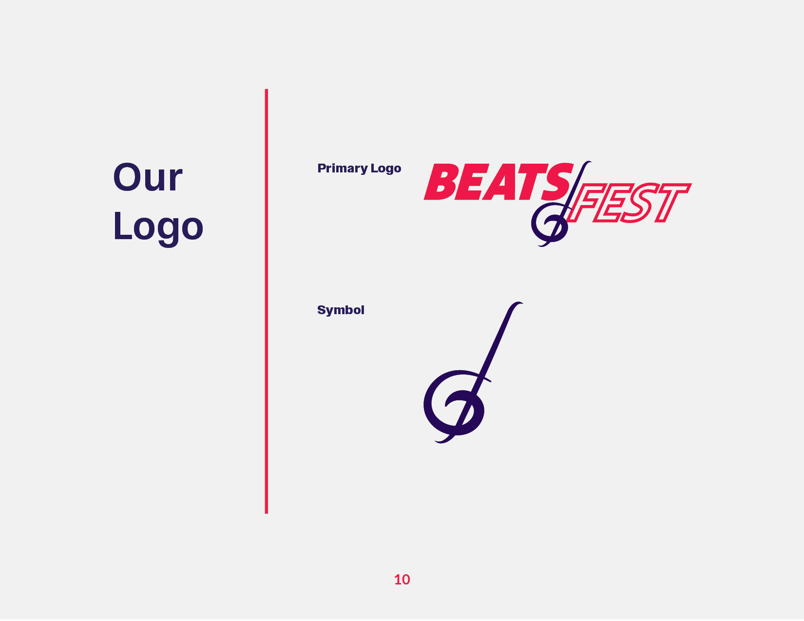
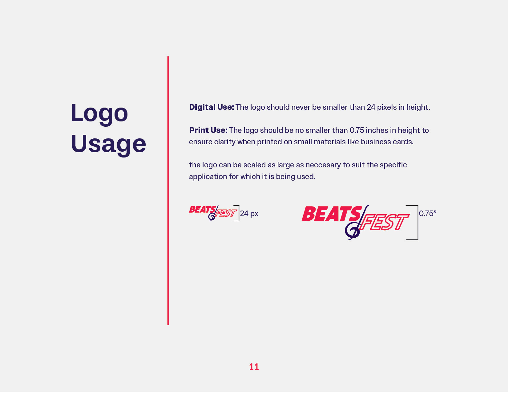
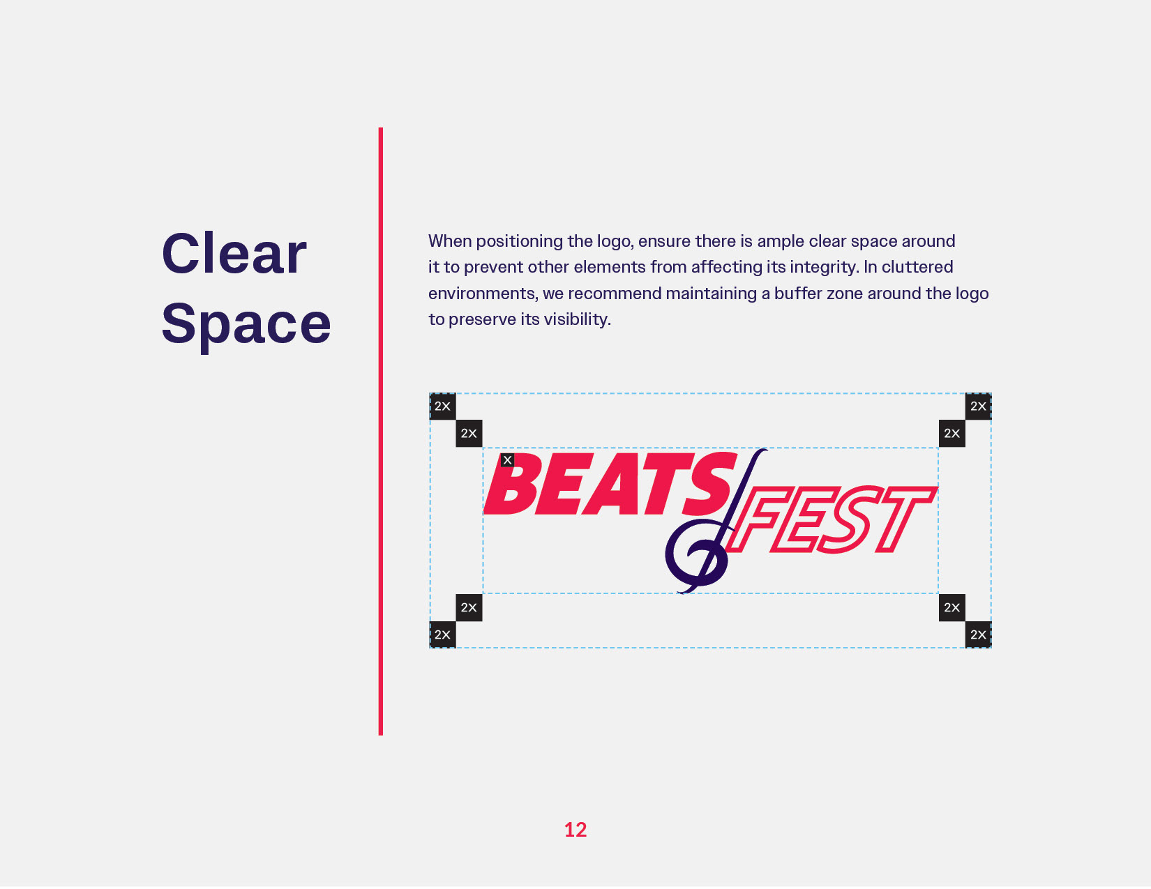
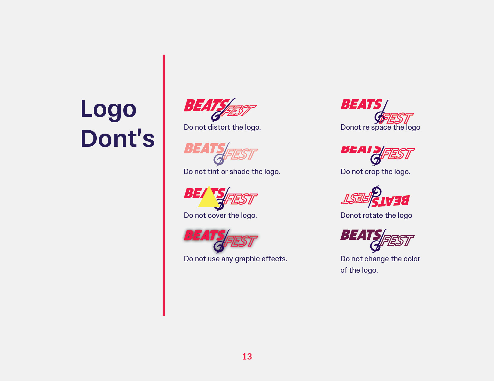
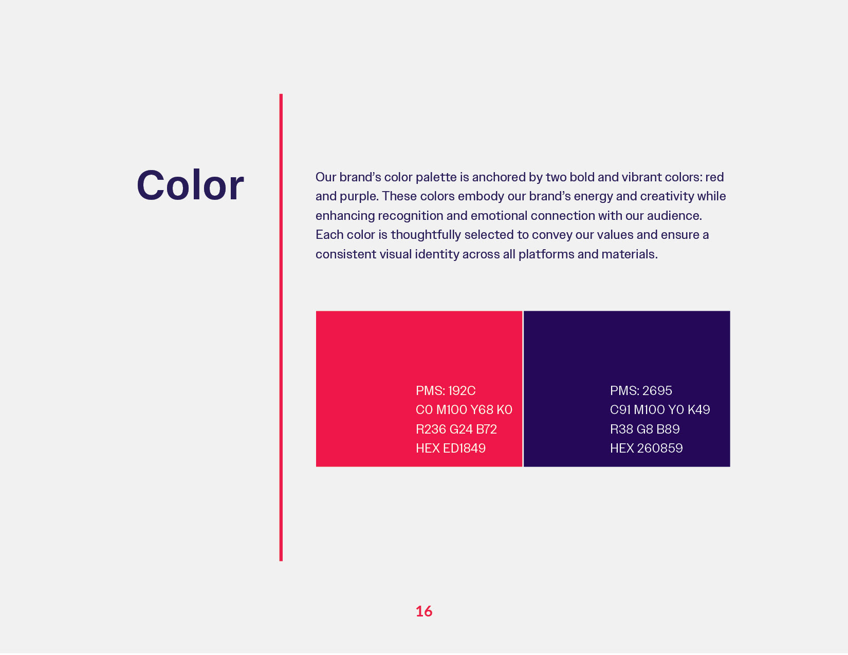
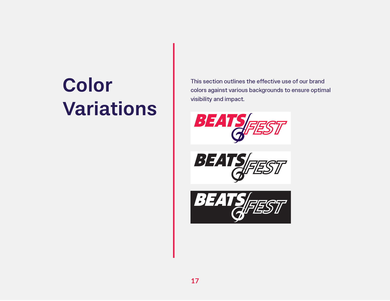
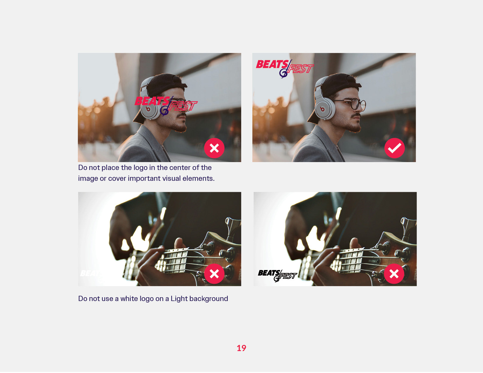
The logo combines a musical note brandmark with a bold sans-serif word-mark, aligning with the audience’s preference for simplicity and clarity. The dual font weights in "BEATS" and "FEST" hint at the variety of music genres offered, adding depth to the design and reinforcing brand versatility. Vibrant red (192c) and purple (2695c) were chosen for their visual energy, reflecting the tastes of Gen Z while ensuring optimal scalability and readability across digital platforms.
Visual Identity & Color Palette:
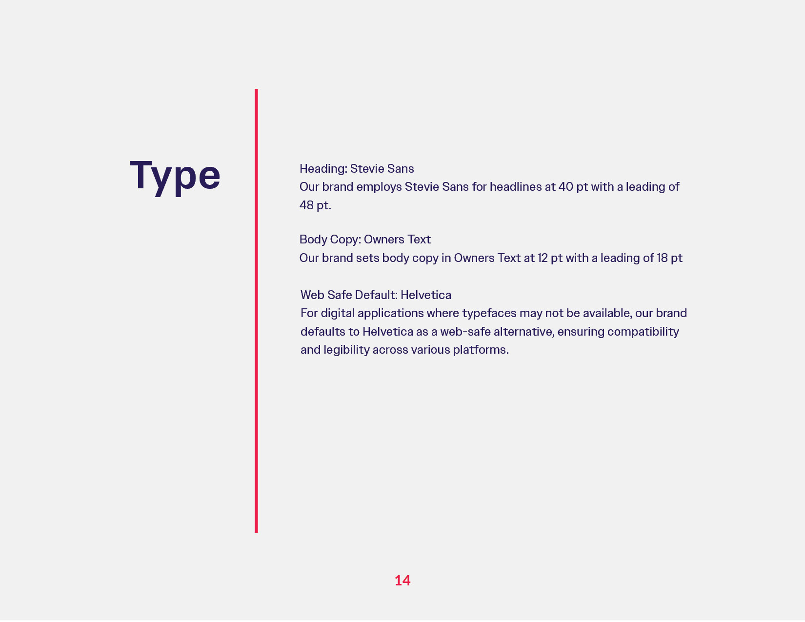
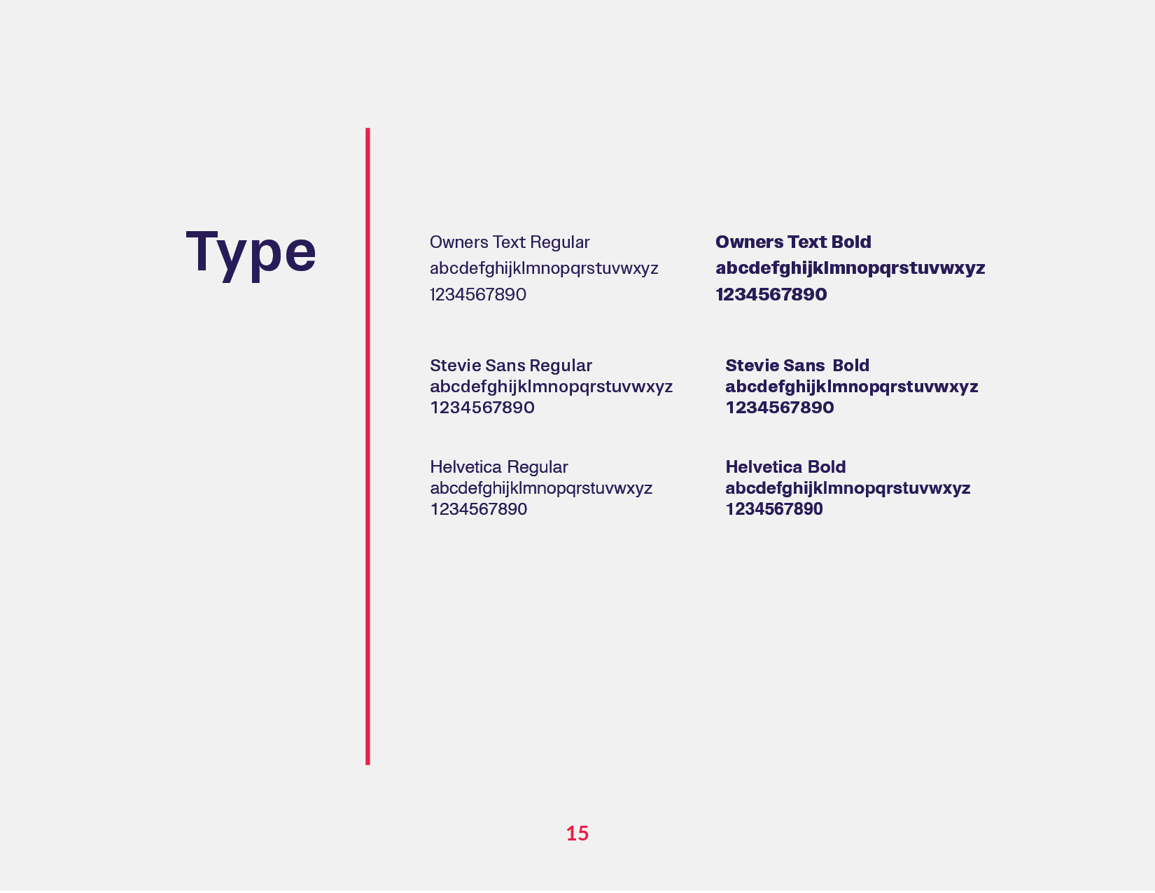
Inspired by insights from popular streaming platforms, the color palette and typography were designed to be both modern and functional. The accessible, high-contrast color choices enhance legibility across devices, and the use of ultra-saturated hues adds a dynamic, youthful feel to the brand’s presence.
Inspired by insights from popular streaming platforms, the color palette and typography were designed to be both modern and functional. The accessible, high-contrast color choices enhance legibility across devices, and the use of ultra-saturated hues adds a dynamic, youthful feel to the brand’s presence.
Tone of Voice:
The guide establishes a tone that is straightforward and businesslike yet informal—ensuring BeatsFest’s communication feels relatable and professional without being overly formal, in line with Gen Z’s communication style.
The guide establishes a tone that is straightforward and businesslike yet informal—ensuring BeatsFest’s communication feels relatable and professional without being overly formal, in line with Gen Z’s communication style.
Tools Used:
• Adobe Indesign
• Illustrator
Logo Design
Brand Guide
